

How to Fix Your Photos |
using free websites, or just your phone!
|
Almost every really great photograph you've ever seen has been edited—even those taken before digital cameras and computers existed. Renowned landscape photographer Ansel Adams was known to have spent an entire day in the darkroom making selected areas lighter and darker on a single print. Unedited photos are so rare that photographers have a special term for it: SOOC (straight-out-of-camera).
You can edit your photos. You should edit your photos. Editing your photos is what the pros do.
You can edit your photos. You should edit your photos. Editing your photos is what the pros do.
Getting into the Editing Habit
The best place to start is with your smart phone—that's probably your camera anyway. You can make a dramatic difference in your photos using the standard photo-viewing app that came with your phone—no additional apps needed. On your computer, try Pixlr.com—a free Photoshop-like editing website
If you're about to use a photo you've already taken for something (article, newsletter, website, poster, etc.), get in the habit of taking a moment to edit. Once you get used to the process, it will only take a few seconds for each photo. Familiarize yourself with the editing tools in your phone. Specifically, look for the tools below (different programs / apps have different names for similar tools; on Pixlr, almost all of these can be found in the "adjustments" menu).
Crop: change the dimensions of the photo by cutting away the edges.
Levels / Brightness / Contrast / Shadows / Highlights / Black Point: alter the lightest lights, darkest darks, and all the stuff in between.
Temperature / Cast / Tint / Color Balance: change the overall color-cast of the photo.
Saturation / Vibrance / Brilliance: make your colors pop.
Avoid: Filters! Anything with names like "dreamy" or "Montana." Filters can give your photograph a stylized "look," but it's better to have your photograph looking its best before you apply any filters.
Oh, Crop!
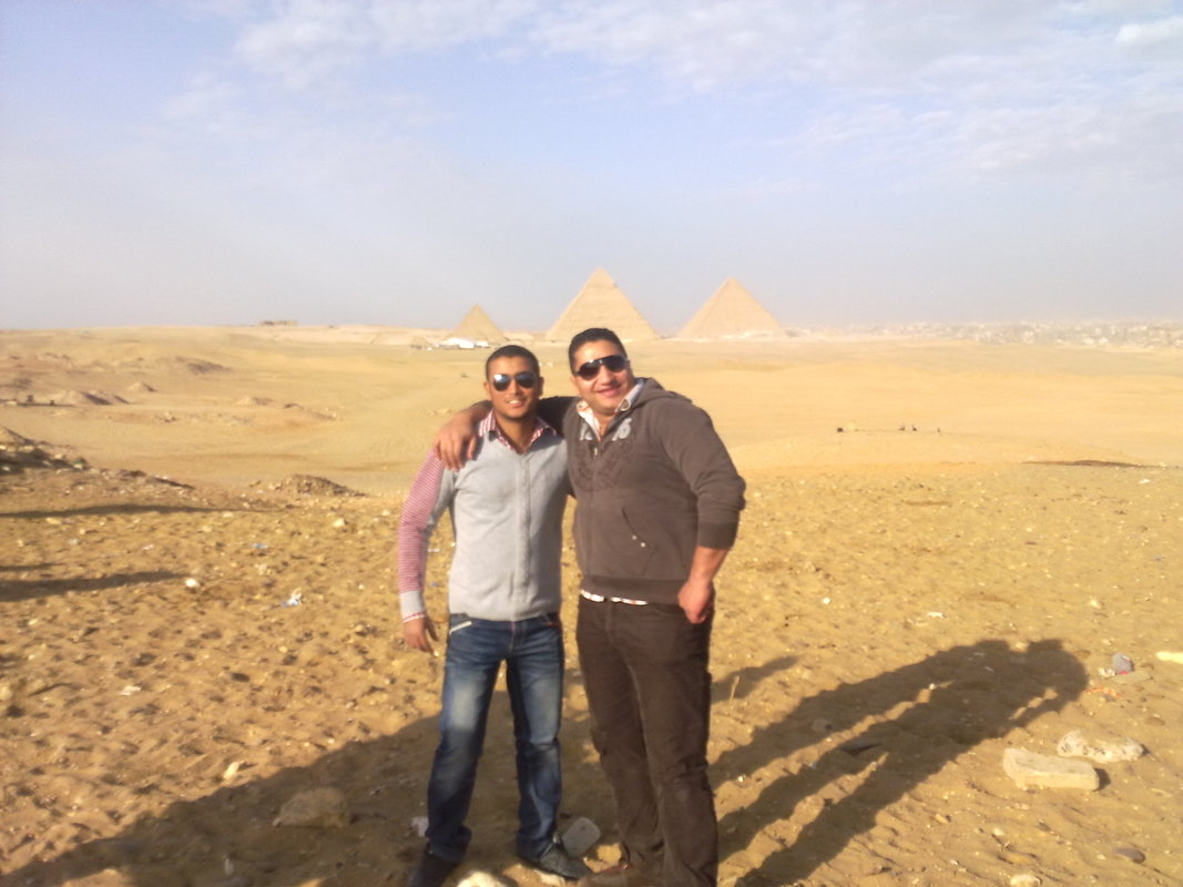
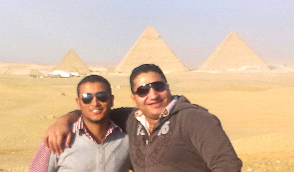
Decide what's most important in your photograph. What do you need to tell the story? Which parts of the photo are just taking up space? In the example below, all extraneous information has been deleted. The photograph shows two friends standing in the sand in front of the pyramids. The only parts that have been removed are more "standing" and more sand.
|
|
Always look for the feet!
Particularly in group shots, amateur photographers often try to put the faces in the middle. The resulting photo tends to have a lot of empty space above the heads of the crowd, while the feet have been cut off. Definitely crop out the empty space above the heads, but if the feet have already been cut off a little (like the example above), crop out even more from the bottom (at least above the knees) so it doesn't look like you tried to get the feet and failed.
Particularly in group shots, amateur photographers often try to put the faces in the middle. The resulting photo tends to have a lot of empty space above the heads of the crowd, while the feet have been cut off. Definitely crop out the empty space above the heads, but if the feet have already been cut off a little (like the example above), crop out even more from the bottom (at least above the knees) so it doesn't look like you tried to get the feet and failed.
Adjust Lights and Darks
Changing the brightness and contrast of your photo will make a world of difference. Most photographs are too dark and would benefit from a little brightening. Cameras also struggle with photographs that have bright areas and dark shadows. The camera is a machine making its best guess about what the photo should look like, and the machine places equal importance on the sunlight outside the glass doors as it does on the black sweatshirt, when in reality neither of those features is important the the photograph.
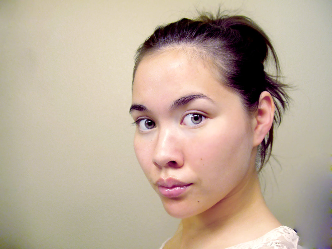
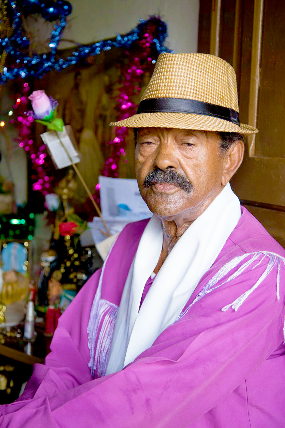
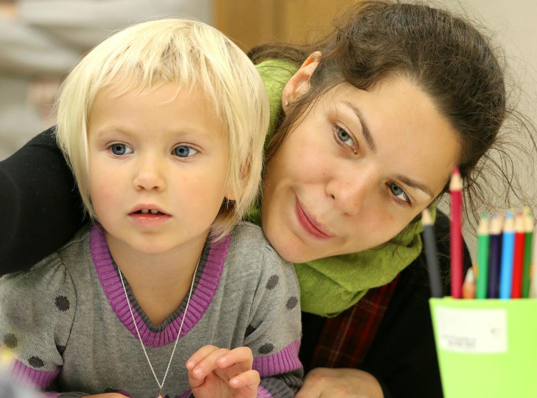
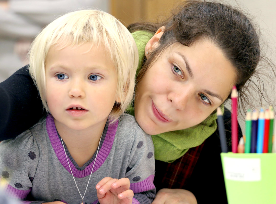
Also consider: color photography has historically been calibrated to make white skin tones look good, while ignoring people of color. While cameras and editing programs have gotten better, it's still important to keep all of your subjects in mind. Keep adjusting until you can see distinct facial features on every face. In the example below, the brightness and contrast have been altered to lessen the shadows on everyone's faces.
Also consider: color photography has historically been calibrated to make white skin tones look good, while ignoring people of color. While cameras and editing programs have gotten better, it's still important to keep all of your subjects in mind. Keep adjusting until you can see distinct facial features on every face. In the example below, the brightness and contrast have been altered to lessen the shadows on everyone's faces.

|

|
Different editing programs offer different tools, but every program will have the minimum needed to make a difference. Look for the instructions for your tools below.
Levels: This usually shows a graph-like thing with sliders below it. If you move the black slider toward the center, the darkest areas of your photo will get darker. If you move the white slider toward the center, the lightest areas will get lighter. If you move the grey mid-point slider toward the dark end, the middle tones of your photograph get brighter. Recommendation: slide the mid-point toward the dark end, and nudge the black slider toward the middle a little bit.
Brightness: This tool brightens the mid-tones of your photograph. Recommendation: increase the brighness, and use this tool in combination with the contrast / shadows / black point tool to make photos look less "washed out."
Contrast: Increasing the contrast will give you lighter lights and darker darks. Decreasing the contrast will bring everything closer to a medium gray value. Recommendation: increase the contrast.
Shadows (or black point) / Highlights: Similar to levels, this will make your darks darker (shadows or black point) and your lights lighter (highlights). If your photo has a lot of shadows, particularly on faces, try making your shadows lighter. Highlights almost never need adjusting. Recommendation: make darks darker unless faces or other important features are in shadow—then make them lighter.
Change the Color-cast
Most photographs are taken in lighting that imparts a color-cast. Direct sunlight is close to true color, but outside in the shade can be very blue. Incandescent lights indoors are yellow, and fluorescent lighting gives a sickly greenish tinge to everything.
Tools labeled "temperature" give you an option to make your whole photo "warmer" (more yellow), or "cooler" (more blue). The "tint" tool lets you adjust between green and magenta. Some color cast tools use a red-to-blue spectrum. Some photo editors have "color balance" which will allow you to adjust all three! Whichever ones you have access to, it's worth it to nudge your photo closer to true hues.
But first! Make sure you adjust your brightness / contrast / levels before you adjust your color. Sometimes that step takes care of much of the color problem. In the example above, colors were not adjusted. The yellowish original photo became much "cooler" when brightened, and color-cast adjustment was not necessary.

|
|
In the photo above, brightness / contrast was adjusted first, and then the cool color tones (too blue) were warmed. This can also be achieved by shifting green-tint toward magenta-tint.
In the example below, a warm photograph (too yellow) was cooled.
In the example below, a warm photograph (too yellow) was cooled.
|
|
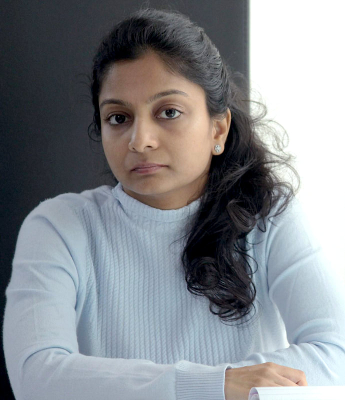
Sometimes the adjustment needed can be very subtle. In the example below, look at the white background behind the subject, particularly just above her arm. It's not "white." It has a slight yellowish tint to it. By adjusting the tint / temperature (and also the brightness / contrast a little bit), we can make the resulting photograph look just a little more professional. The wall is irrelevant, but notice that fixing the color of the wall makes her face look better, too.

|
|
You can also use temperature adjustments to change the mood of a photograph. Oregon gives us many glorious overcast days. When that is your only option, it can seem like your photos are often dull and lifeless, and don't accurately represent the sunshiny feeling in your heart. Don't worry: you can "warm" that day right up with the temperature tool! This works best with a little saturation boost (saturation explained below).
|

|
Make Your Photos Pop
The saturation tool will make your bright colors brighter (vibrance and brilliance are similar tools, which also incorporate brightness at the same time; if you have the option of saturation by itself, use it).
If you bring the saturation level down to zero, the result is a purely black-and-white photograph. Sometimes this is your goal. If so, do this before adjusting your brightness / contrast so you can truly see your blacks and whites. If you bring your saturation to the highest possible level, your photo will look like a carnival. This should rarely be your goal.
Adjusting saturation is an exercise in restraint. Making colors brighter looks good, so it is tempting to overdo it. While you're learning, it's a good idea to push the saturation to a level that looks great to you, and then bring it back about halfway. Often, you'll find that half of what you thought was right originally still looks good, and also looks more realistic.
Before adjusting saturation, make sure you adjust brightness / contrast and color-cast first.
|
|
Go Big or Go Home
In photography, file-size matters. Images are sometimes referred to by their dimensions in inches, along with a resolution given in dpi, or dots-per-inch. On a computer screen, images look good at 72-110 dpi. That means a 3"x3" image at 72 dpi will look great if it's 3" or smaller on your screen. Printed items need a higher resolution to look good, generally 300 dpi. That same 3" photo at 72 dpi will look blurry or pixelated (blocky) when printed, unless it's about 3/4" or smaller.
Back when the internet was in its infancy, small photos were necessary or they would take all day to load on the page. Now, internet speeds are fast and data plans are huge. Bigger is almost always better. If you have the option to save or send a photo that will ultimately be used on anything larger than your phone screen, use the highest resolution / biggest possible option.
The image on the left below is 150 x 188 pixels. If you divide those numbers by 72 dpi, you get just over 2" x 2.5". On a computer screen, this image is displayed larger than that, and you can see that it is blurry. If you're looking at this on a smallish phone screen, zoom in on the image to see the blurriness as it gets larger.
The image on the right is 2400 x 3000 pixels. If you divide those numbers by 300 dpi, you get 8" x 10". The photo on the right could be printed at 8" x 10" and still look crisp. On a computer, 2400 pixels is wider than almost any computer screen (2400 pixels / 100 dpi = 24"), so this image will look crisp no matter what.

|
|
Putting it All Together
Sometimes your photos will need a lot of editing. Some photos are beyond help, but it's always worth it to give it a try to see what basic photo editing tools can do.

|

|
Other times, you may think you have the perfect photograph—an SOOC masterpiece! It's still worth it to see what your photo editing tools can do. The finished product may be only slightly better than the original, but it will make a difference.
|
|

|
|

|
|
About
|
News & Trainings
-:- More Events -:-
|
Schools
|
Programs
|
Services
|
|
Our Districts
|
For Parents
|
Staff Resources
|
Contact
|
|

|
Multnomah Education Service District prohibits discrimination and harassment on any basis protected by law, including but not limited to race, color, religion, sex, national or ethnic origin, sexual orientation, mental or physical disability or perceived disability, pregnancy, familial status, economic status, veterans' status, parental or marital status or age. For more information and detail on MESD's non-discrimination policies, including procedures and contact information for reporting discrimination, please visit the MESD Non-Discrimination, Harassment & Bullying Notice page.
|
Multnomah Education Service District is in the process of making its electronic and information technologies accessible to individuals with disabilities. If you have suggestions or comments please contact the Office of Strategic Engagement: 503-257-1516. For more information, visit the Collaborative Accessibility page.
|
.